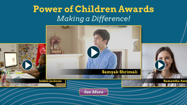
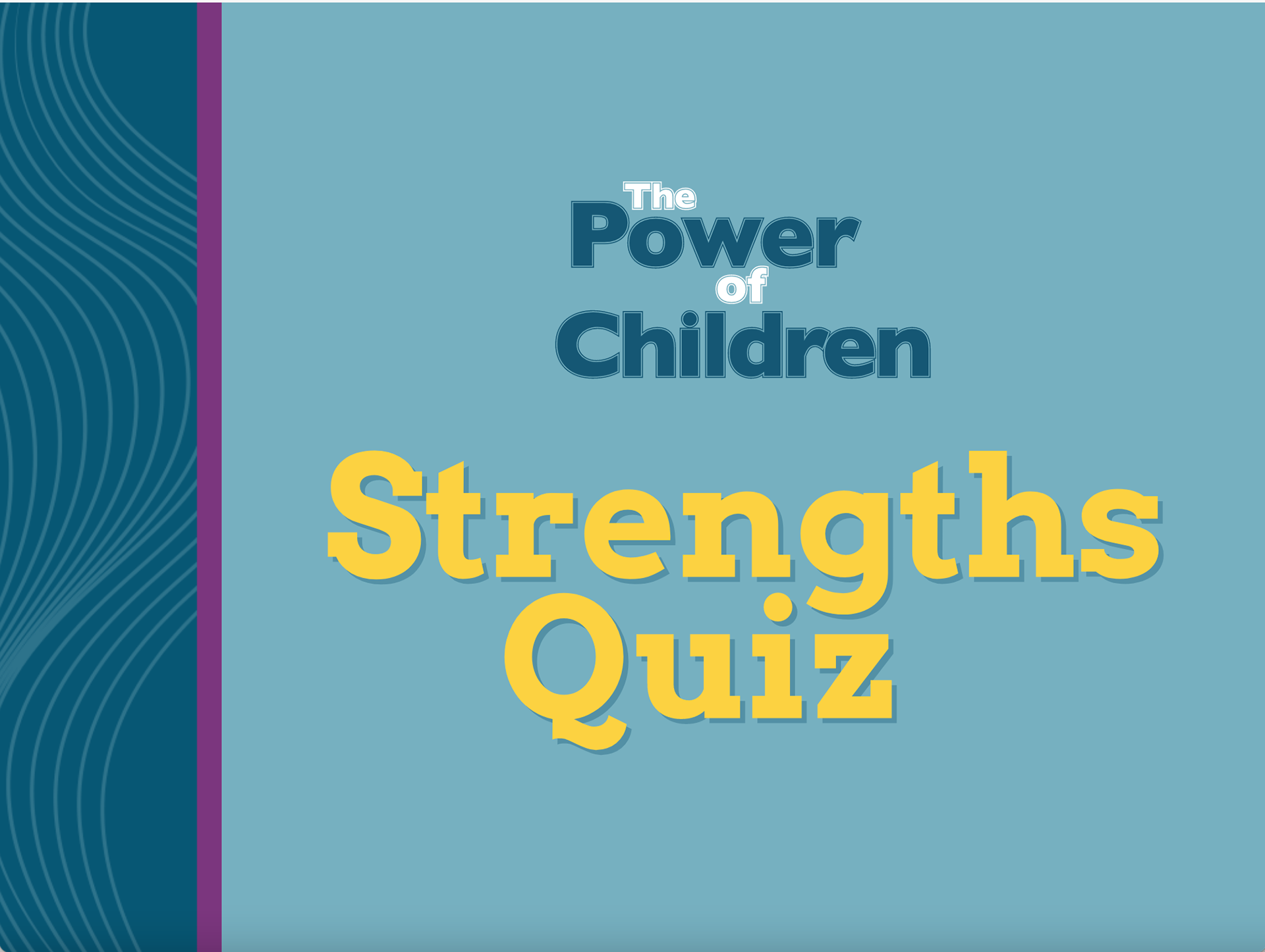
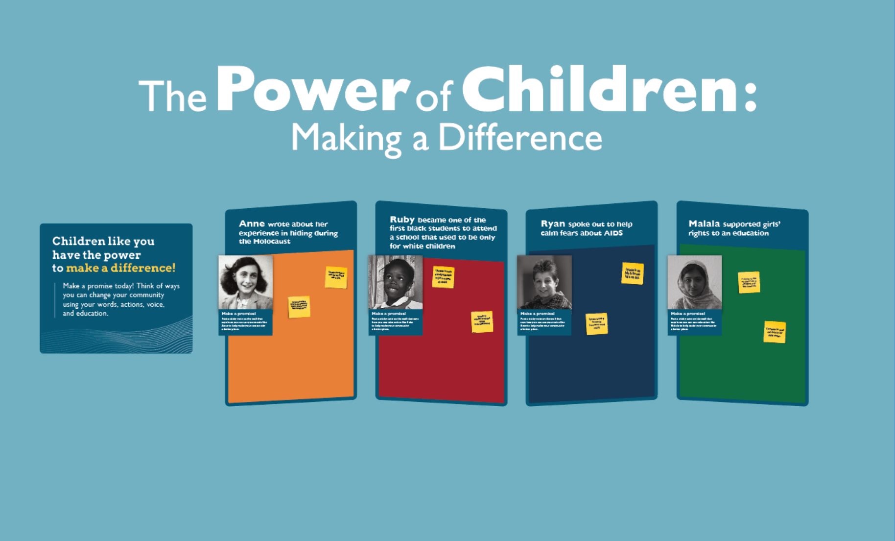
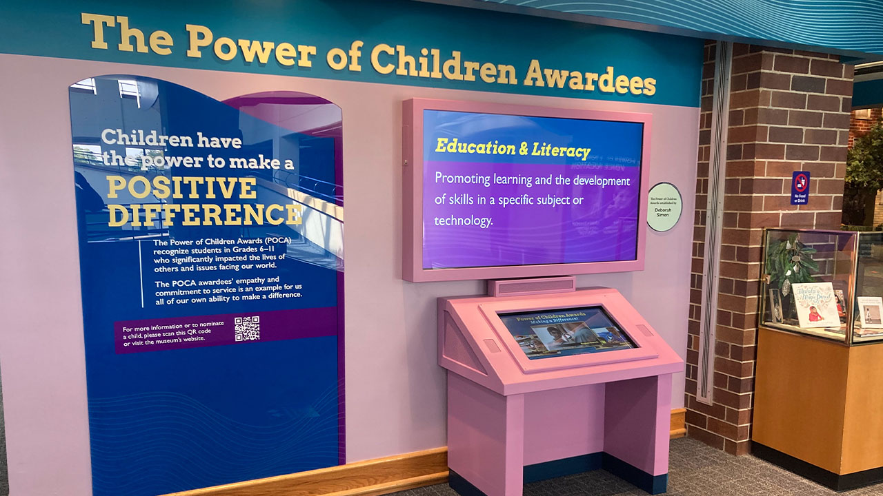
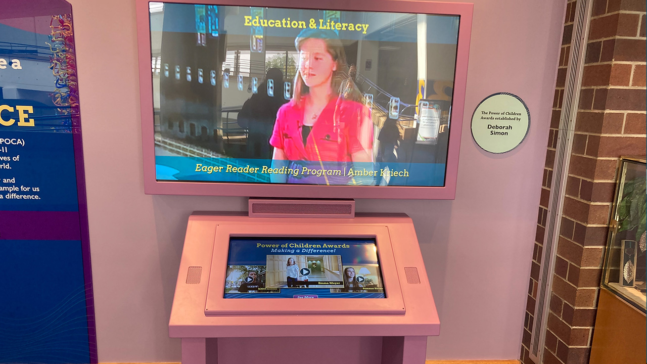
The Power of Children Awards celebrates young people who help to make the world a better place. Each year The Children’s Museum of Indianapolis recognizes several young people who are making a difference in their world. This touchscreen kiosk was designed to allow families to search through previous winners, and to inspire them to think about how they could change the world too.
Problem: Users need a more effective way to explore the previous Power of Children Award winners.
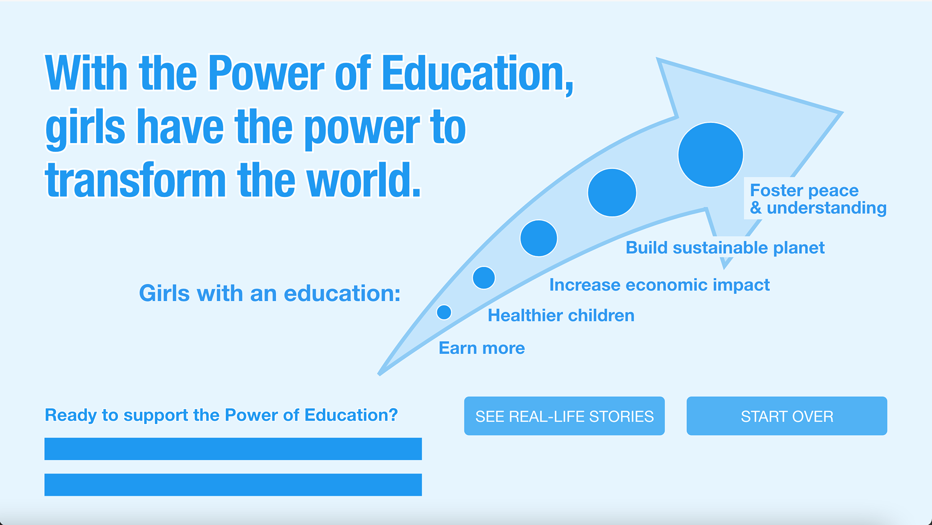
Goal: To encourage young people to consider how they might impact their world for the greater good.
Role: User Interface Designer
Project Duration: 4 weeks
Meeting the Stakeholders:
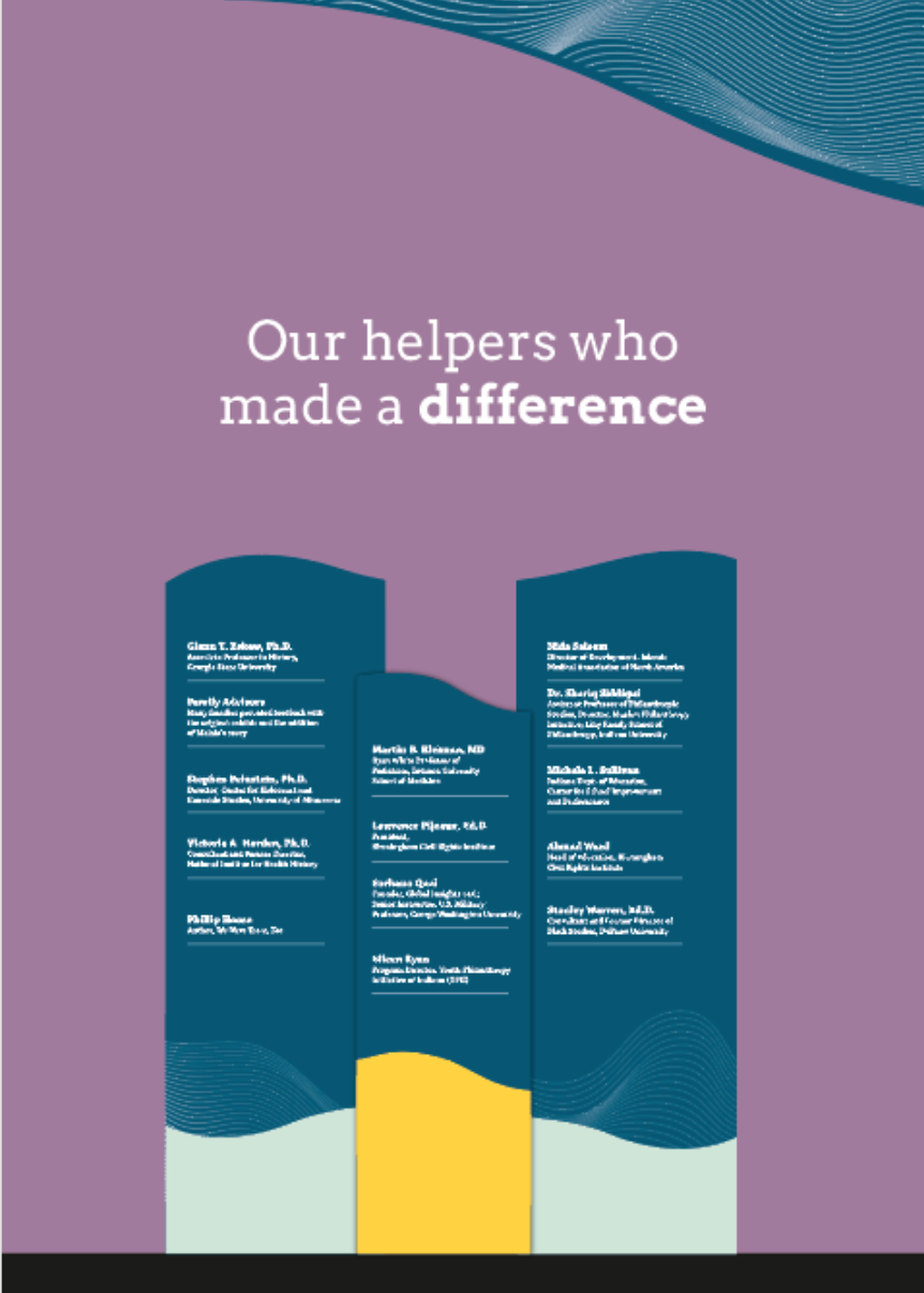
The first step in this project was to meet with the major stakeholders involved in the project. This included project managers, exhibit designers, the chair of the Power of Children committee, and the design team. Some key requirements were established during these meetings.
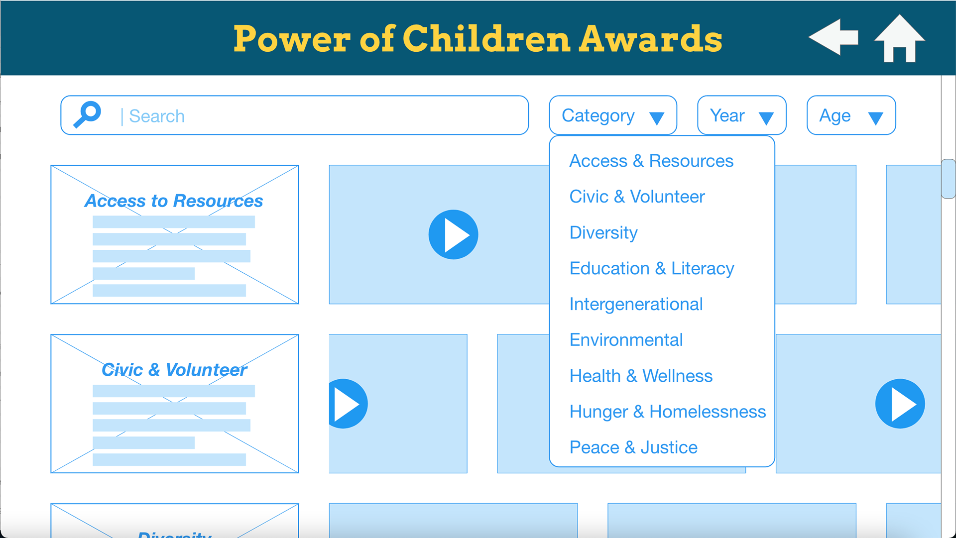
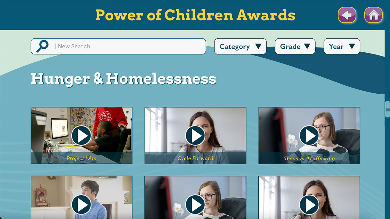
- Users need to be able to browse by social issue, as well as through a basic search feature.
- Each social issue would include a short description with a character limit of 15o characters.
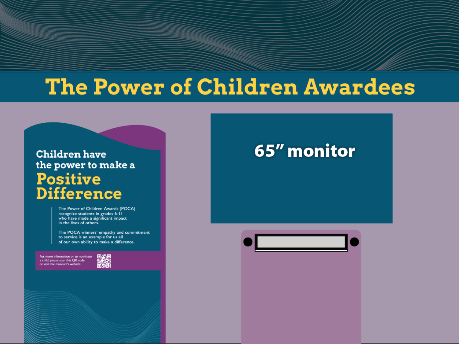
- The display would be a 32″ touchscreen with a resolution of 1920×1080.
Research:
Since this was a digital product for an already established exhibit most of the key research had already been completed. I asked for a few samples of similar apps that had already proven successful to use as models for the project.
Most of the samples were wireframes, but one was an app that was already being used in The Power of Children exhibit. These proved useful for establishing iconography, button styles, and touch target sizes.
Empathize:
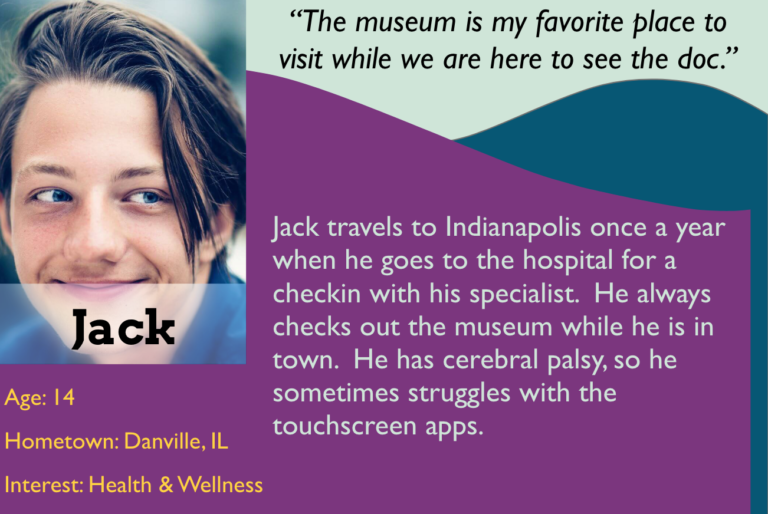
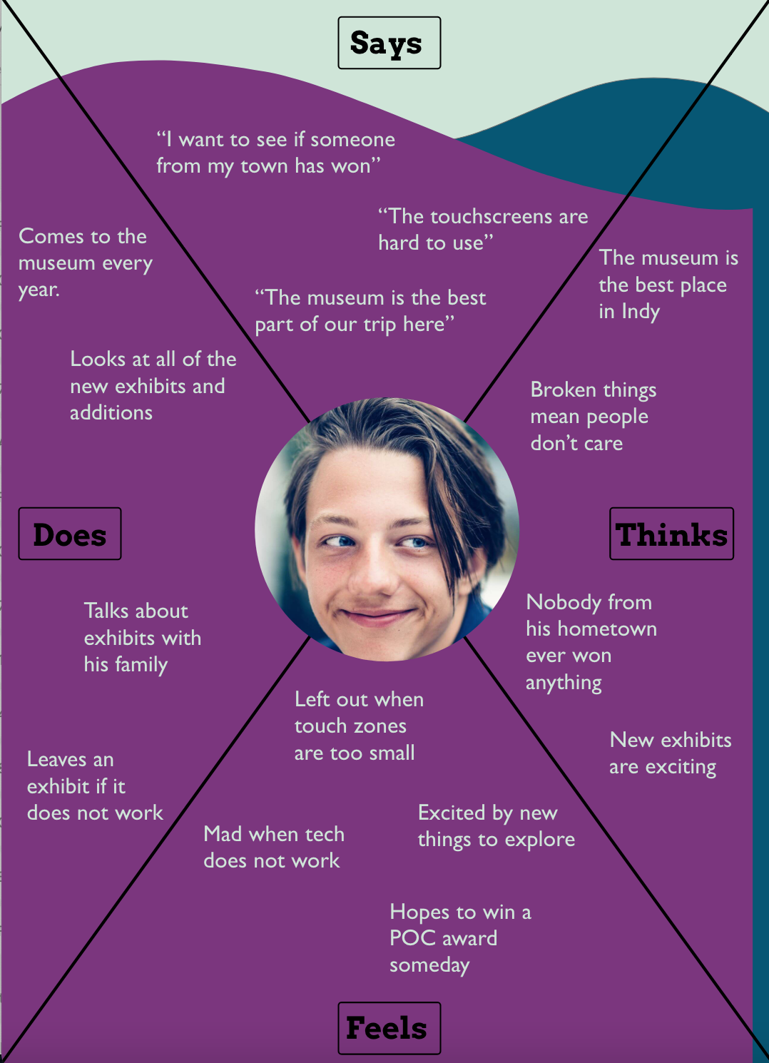
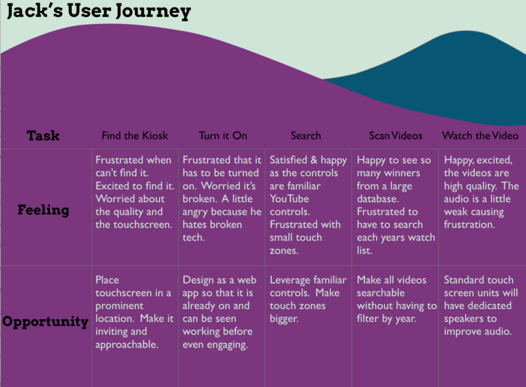
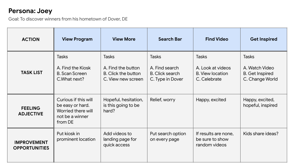
I took a little time to empathize with potential users by creating personas, empathy maps, and user journeys. Jack is an example of a persona that I created based on a research project that I completed for a digital map a few weeks earlier. Jack generally struggles with touchscreens because he has small motor skill limitations. In order to meet his needs, I made the touch target zones larger than previous applications.
Ideation:
After establishing some basic project goals it was time to begin the ideation process. This included a brief brainstorming session and conversation with the project manager. I used a brainstorming exercise and a whiteboard to get a few ideas out and then worked on several user journey maps to make sure I understood how the product could work.
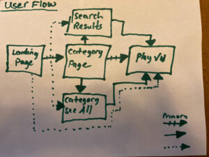
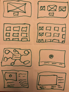
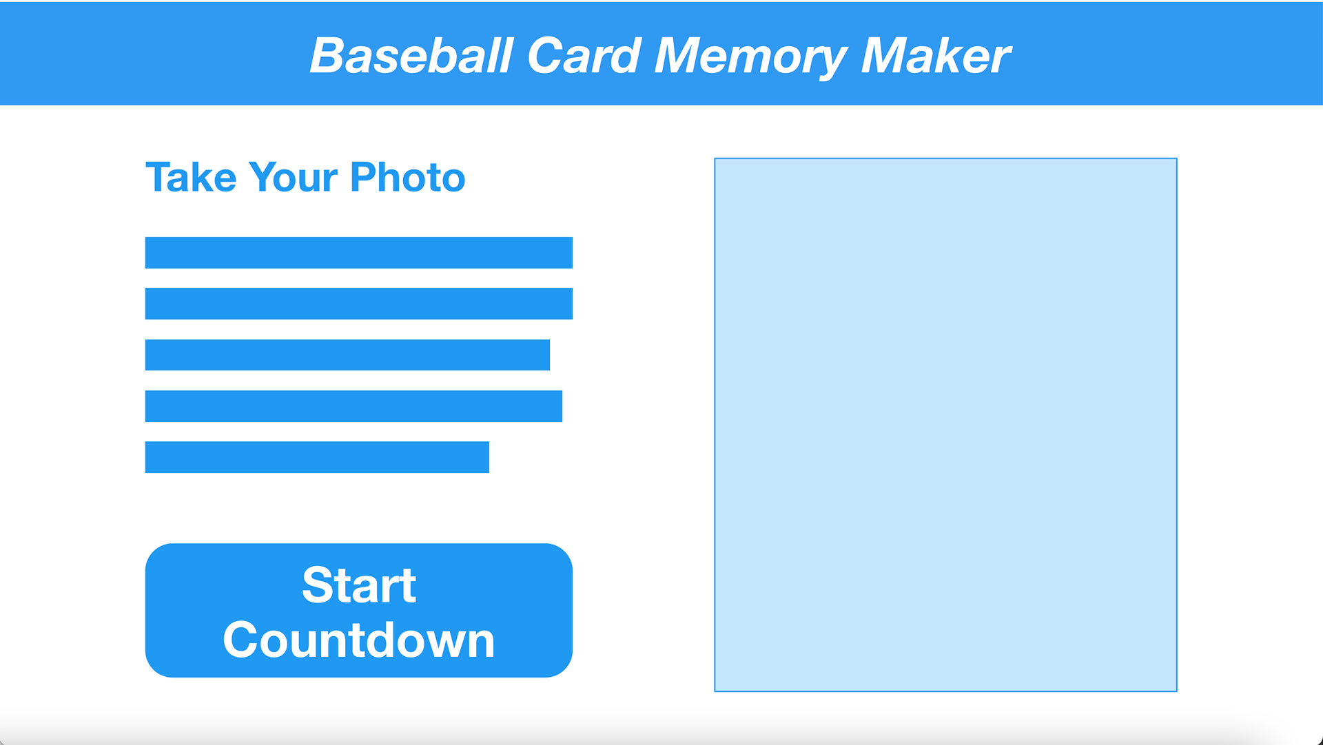
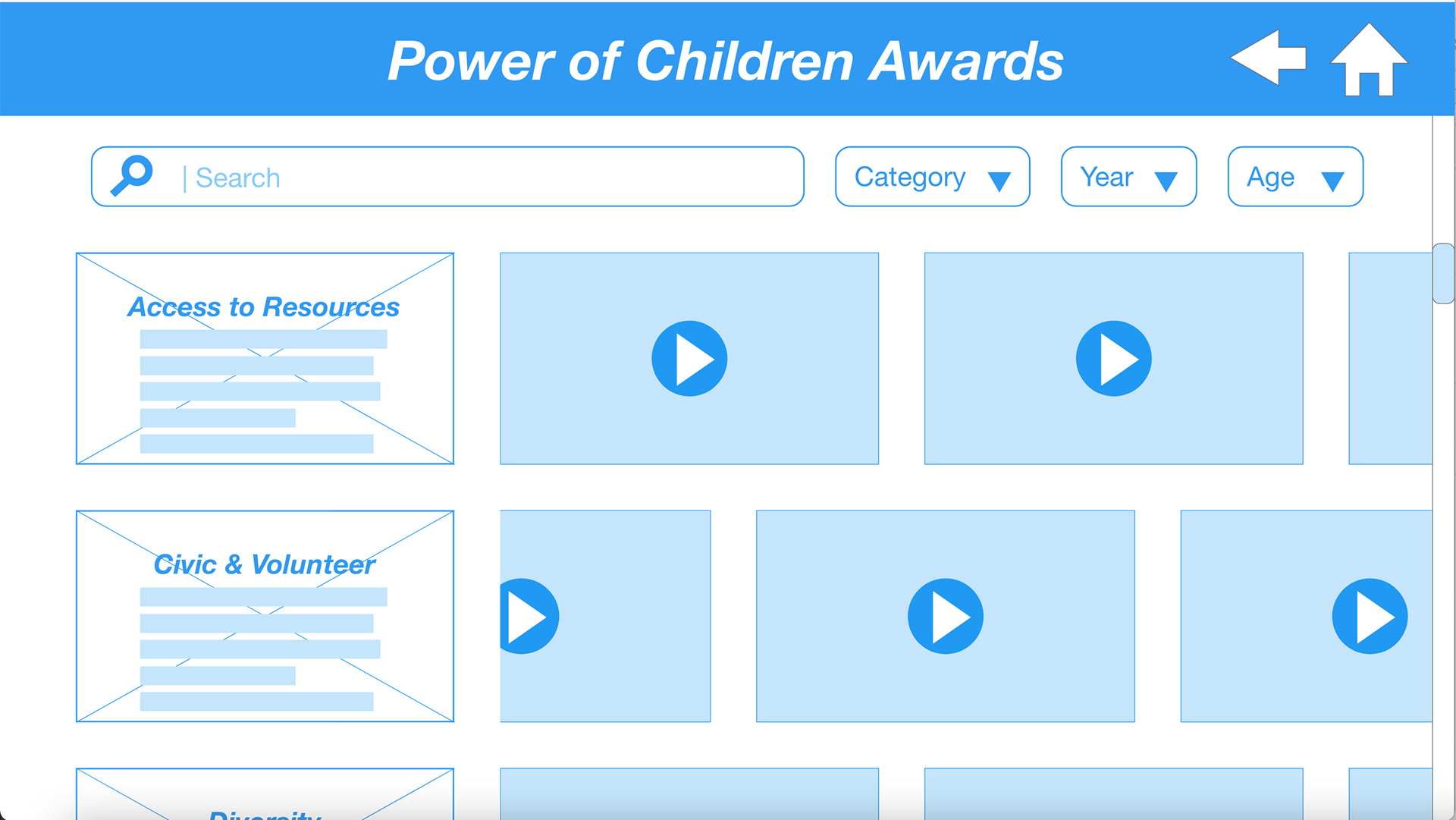
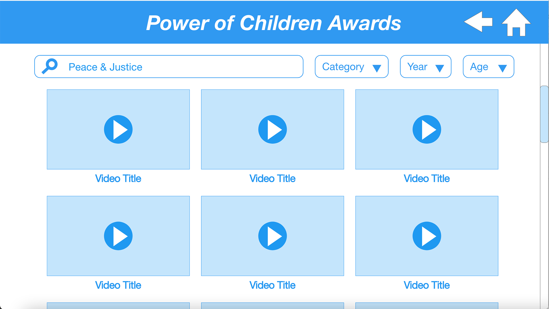
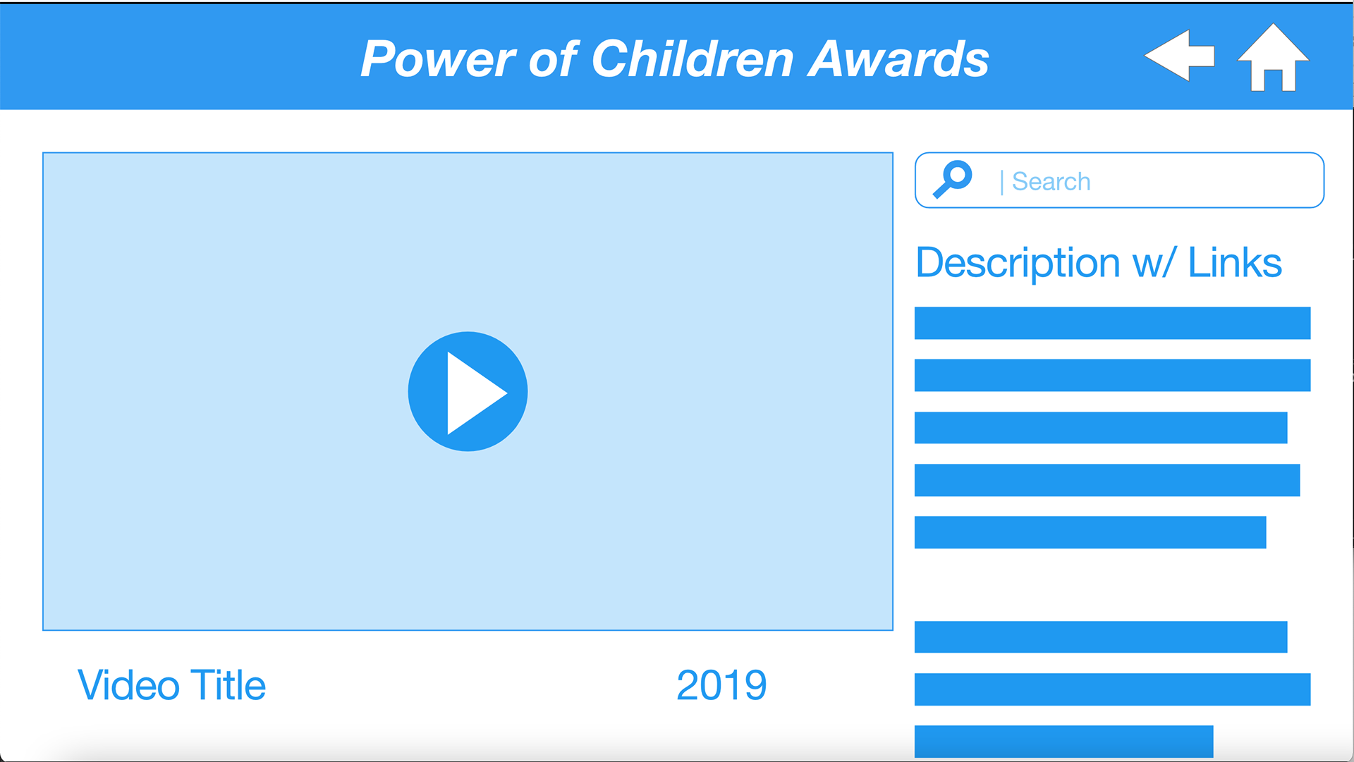
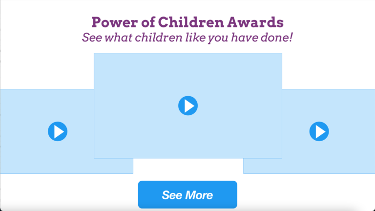
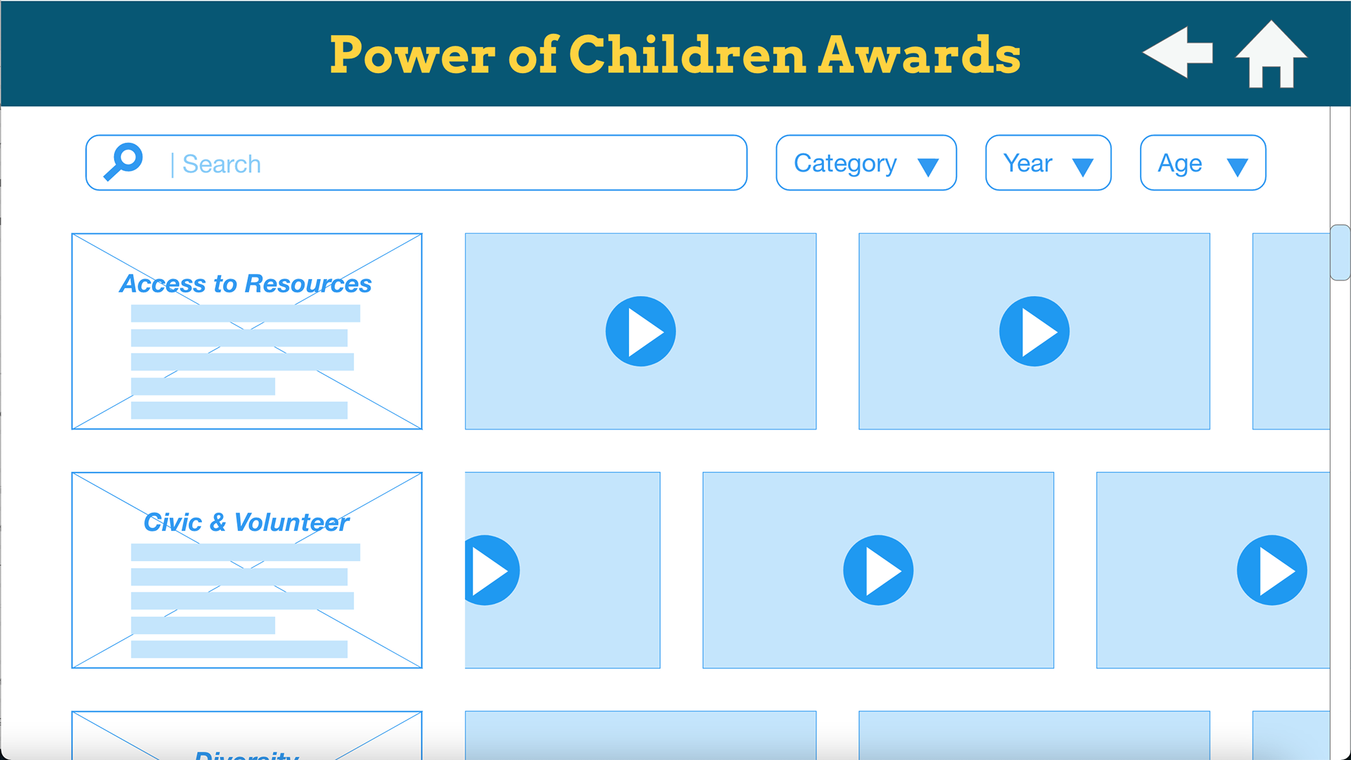
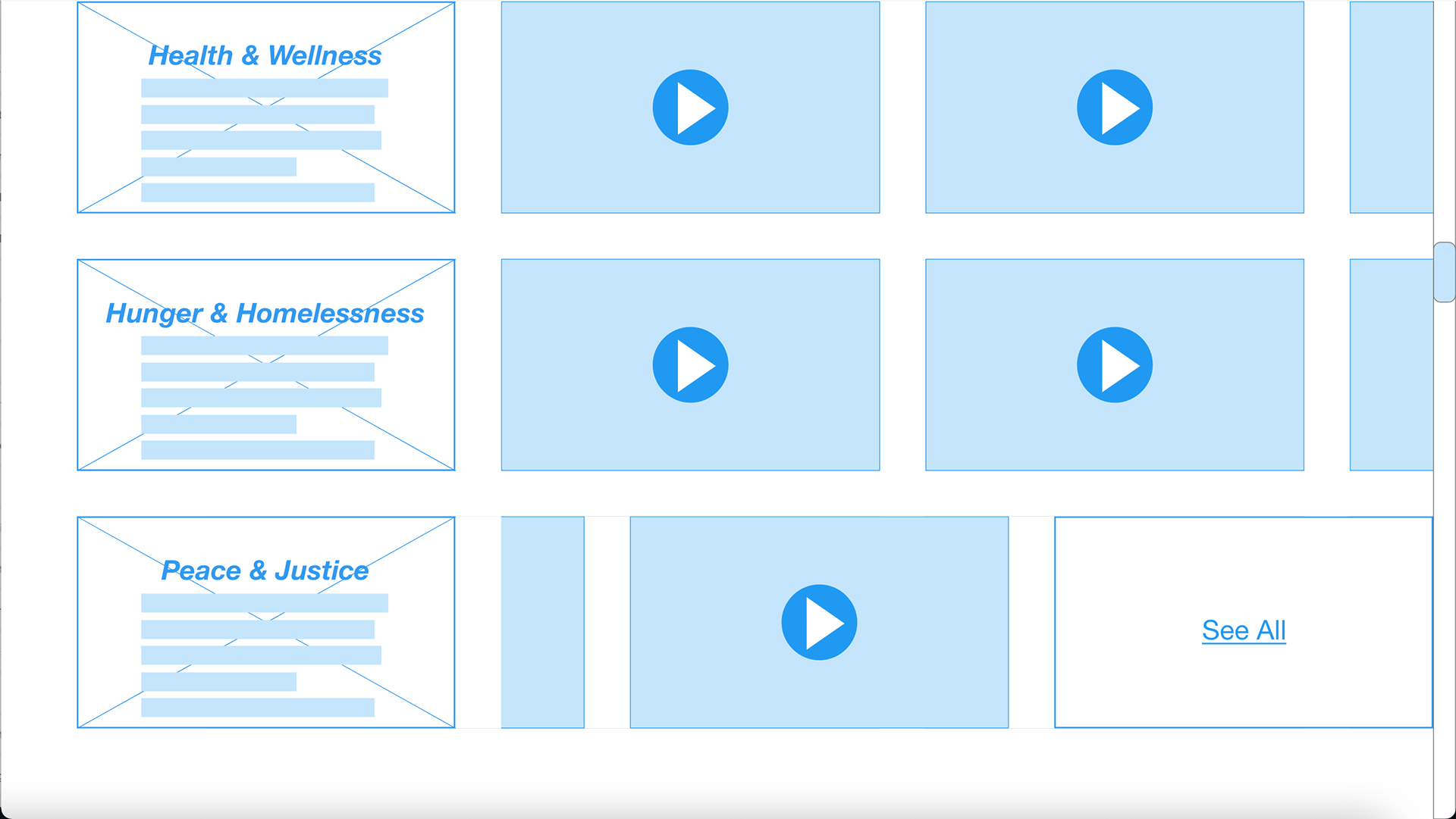
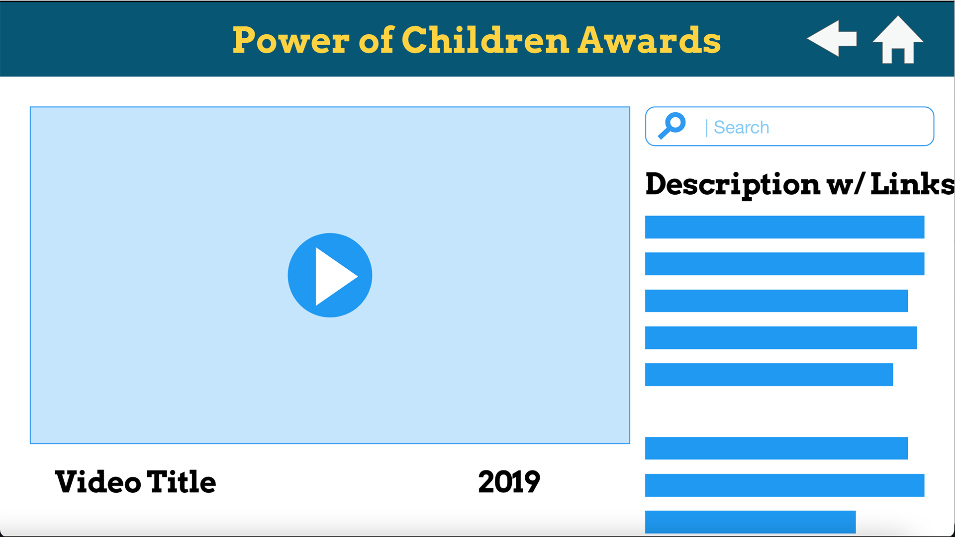
Wireframes:
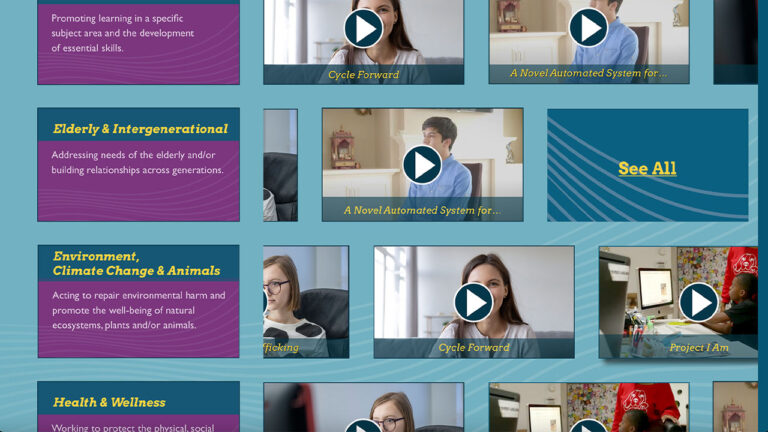
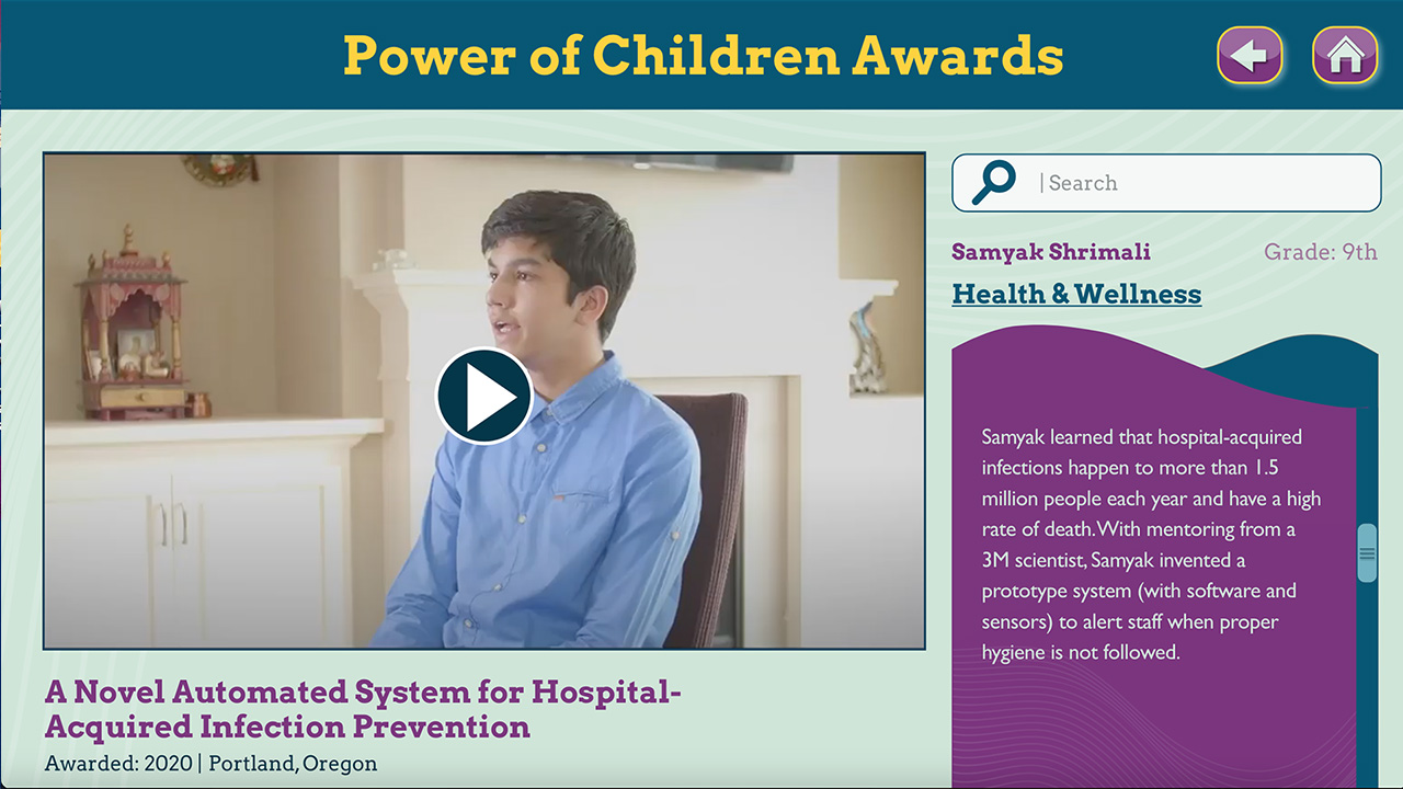
At this point, it was time to start getting some ideas on paper so that I could discuss those ideas with the product manager and the developer. I started with three basic screens and added a fourth once I confirmed that I was on the right track.
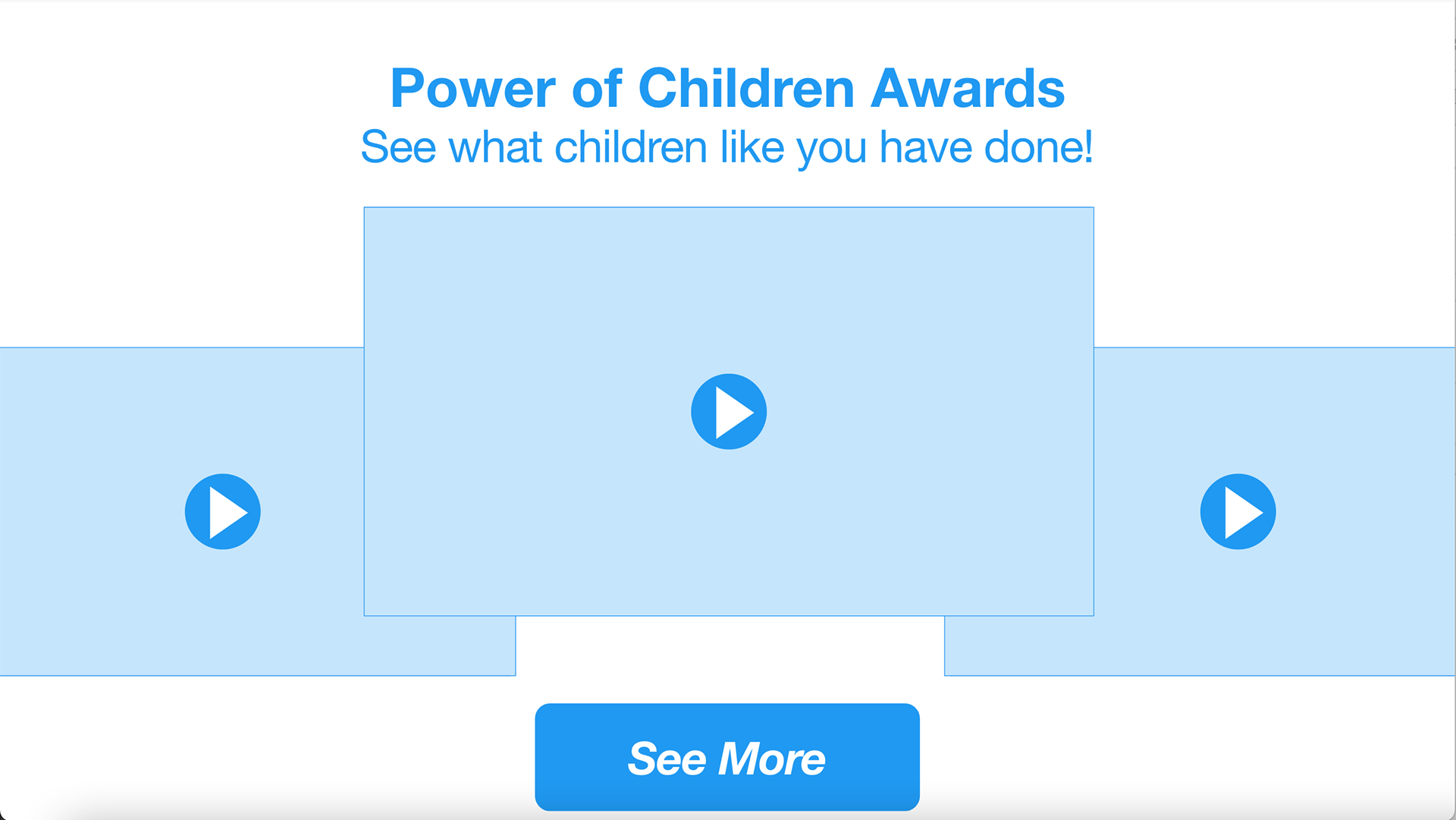
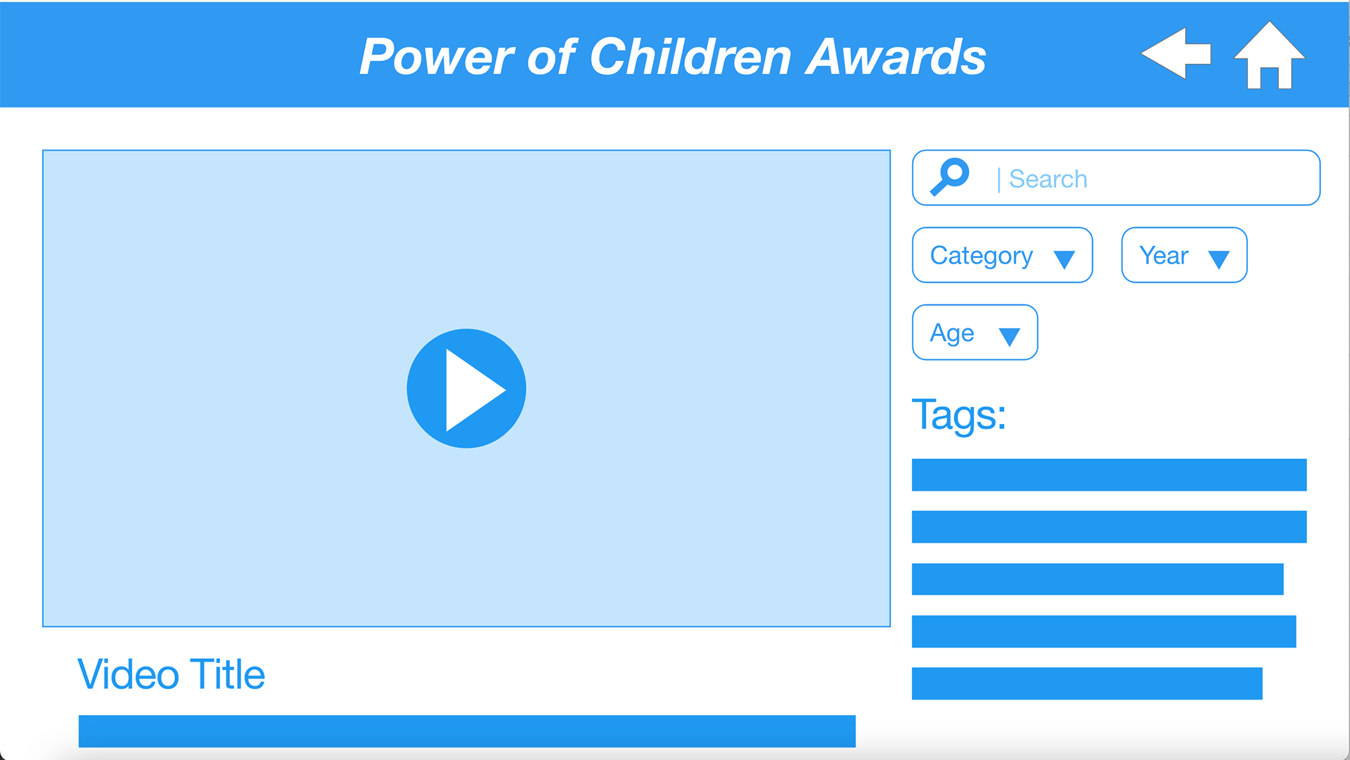
We had several discussions around the screen that played the video and how the title & category information would be displayed. I decided to create an alternative screen, so they could see how both of the options might function.


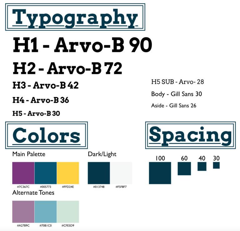
Design System:
Once I had the design details from the graphic designer I created a design system so that I was prepared to begin the high-fidelity mockup once the wireframe concept was approved.
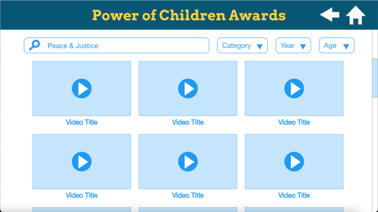
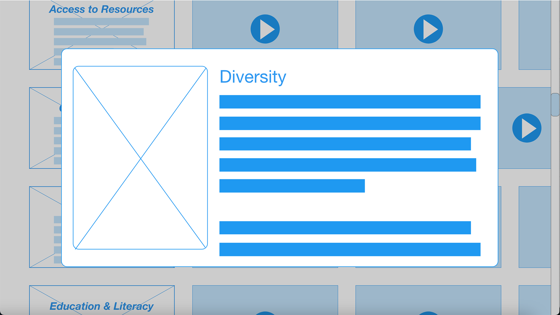
Wireframe Version 2:
I modified the wireframes to reflect the changes and features requested by the stakeholders. The following wireframes reflect those changes.
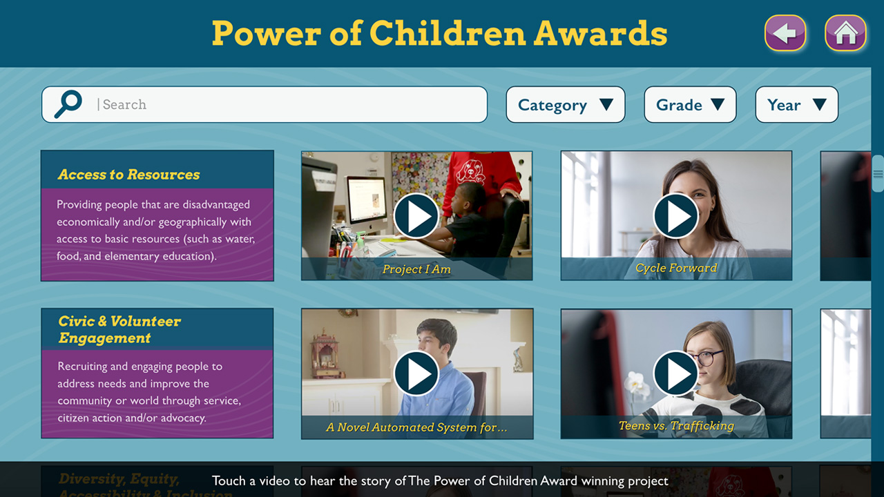
High-Fidelity Prototype:
With the concept and functionality approved it was time to start applying the design system and lay out what the final product would look like.
Prototype Video:
Development & Installation:
This prototype was presented to the stakeholders who asked for a couple of minor changes but approved the project for development. The web application was developed on the ModX platform using HTML, CSS, Javascript, and the ModX library. The installation was placed just outside the Power of Children Exhibit as a centerpiece to draw attention and traffic to the exhibit.
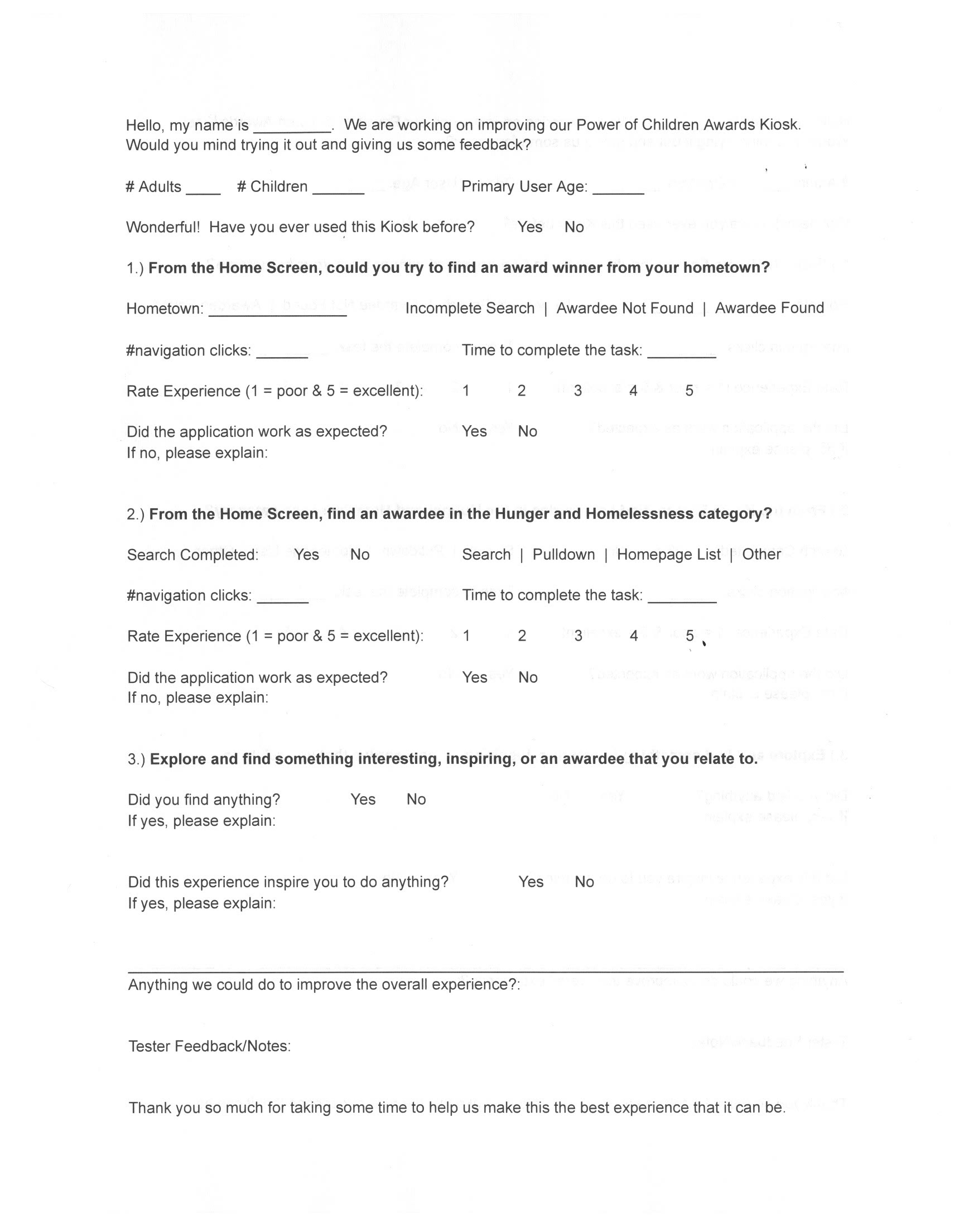
User Testing:
I met with the Research & Evaluation Team as well as the Interactive Media Team to determine what everyone wanted to learn in the first round of user tests. I created a couple of user tasks and qualitative interview questions and used those to make a data collection tool.
Next Steps:
Some informal testing has been completed, but we are waiting until the holidays when traffic will be high to do the observations and interviews for the official user tests. What follows are the next identified steps for this project.
- Add the category description to the top of the page when showing the results of a category search.
- Conduct at least 20-30 user tests using the first data collection tool.
- Compile the data and make recommendations for changes.
- Iterative development.
Learnings:
- Despite the pre-existing research on this exhibit, I think the project could have benefited from a couple of formative interviews.
- The ideation phase could have benefited from a brainstorming session with other designers. It was clear that the best ideas in this project came from the moments of collaboration and cross-pollination with other designers.
- The wireframe prototype would have benefited from a few user tests before moving on to the high-fidelity prototype.
- I learned to make better use of the Adobe XD component feature in this project. I made use of them for the icons but did not make use of them for the video layout, which meant extra work when I needed to change the styling.