
Ecuagenera is a family owned company specializing in the production and conservation of various orchid species. After a friend expressed some frustration over their website, I spent a weekend creating a prototype that would improve on their user experience.
Navigation:
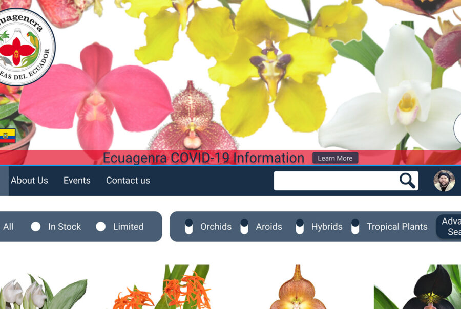
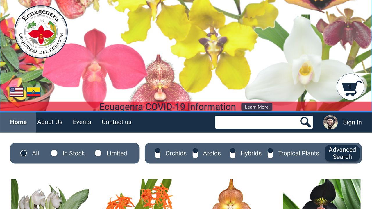
Below and to the left you can see their homepage and navigation with my improvements shown in the picture to the right. I was able to reduce the number of navigation menu items while bringing them all closer together, grouping like items in one place for easy access. I also reduced the amount of scrolling required to start shopping.
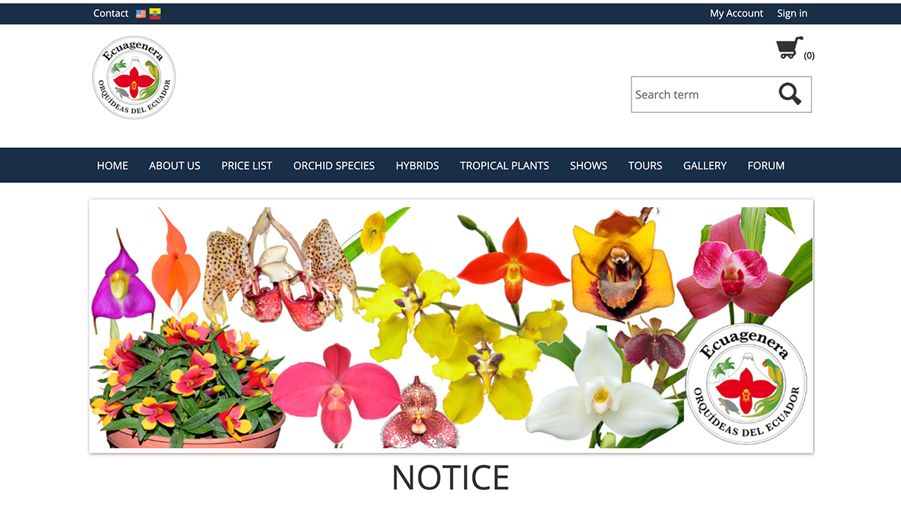
Original Version
Redesigned Version
Complicated drop down navigation was replaced with a filtering system for most searches, and a streamlined advanced search for specific needs.
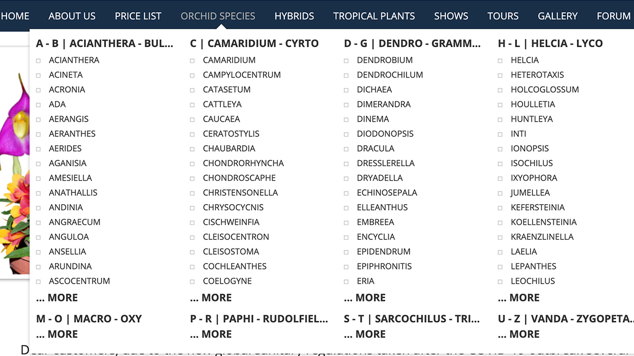
Original Version
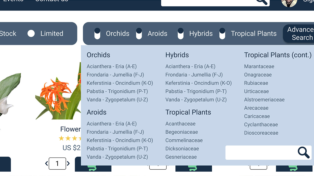
Redesigned Version
Standardized Styling:
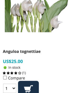
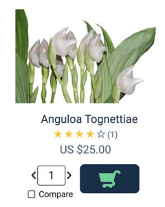
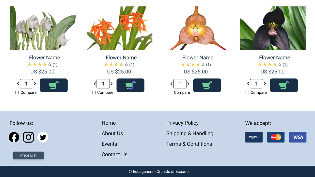
The list items were cleaned up to include the most important information in an attractive way. The text was centered to add balance, and colors were adjusted to improve contrast and highlight the call to action.
Original Version
Redesigned Version
Footer:
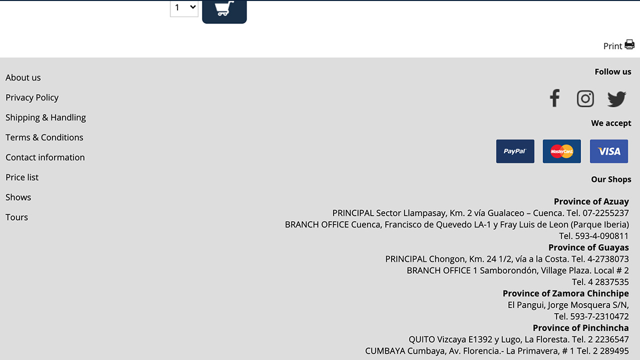
The footer was simplified by moving the contact information to it’s own page, and the site map was reduced to reflect a more simple navigation flow.
Original Version
Redesigned Version
Simplification:
The layout for many of the site pages were simplified to allow them to be easily combined, thus reducing the number of required pages. For example, the old “About Us” page had three subpages. This was solved by simplifying the “Shops” page into a small section integrated into the “Contact Us” and the “About” pages
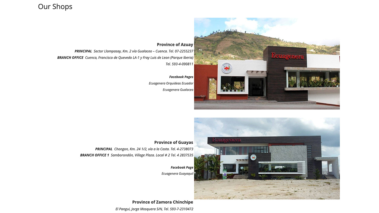
Original Version
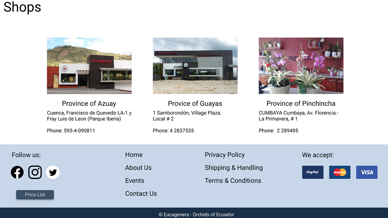
Redesigned Version
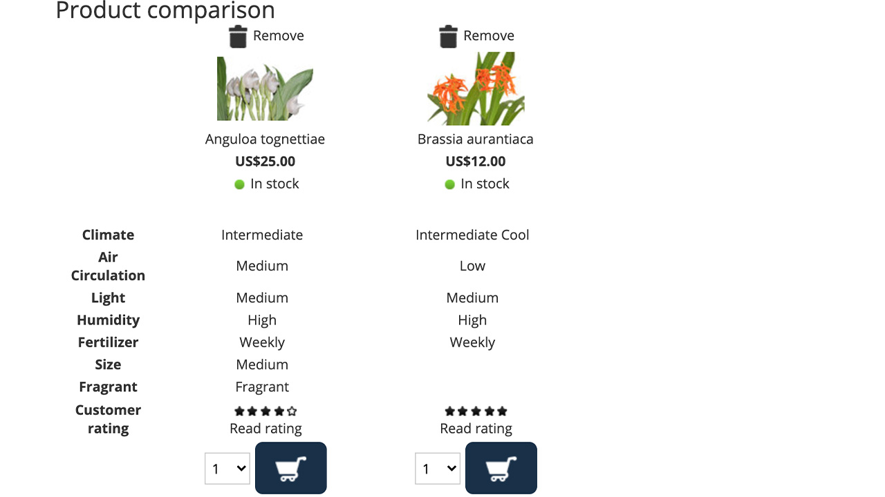
Compare Feature:
The compare feature was replaced with a popup compare feature. The old version required the user to click all of the flowers they wished to compare, and then to click on the word “compare” to access the feature. Users received no feedback after clicking the checkboxes and did not know that the word “compare” was even clickable. Many user gave up before accessing the feature successfully. The proposed prototype provides instant feedback to the user with a popup picture of the flower on the bottom of the screen. Once they click another flower, it also pops up on the screen. If they want additional details on the flowers there is an easy to find button to access those details.
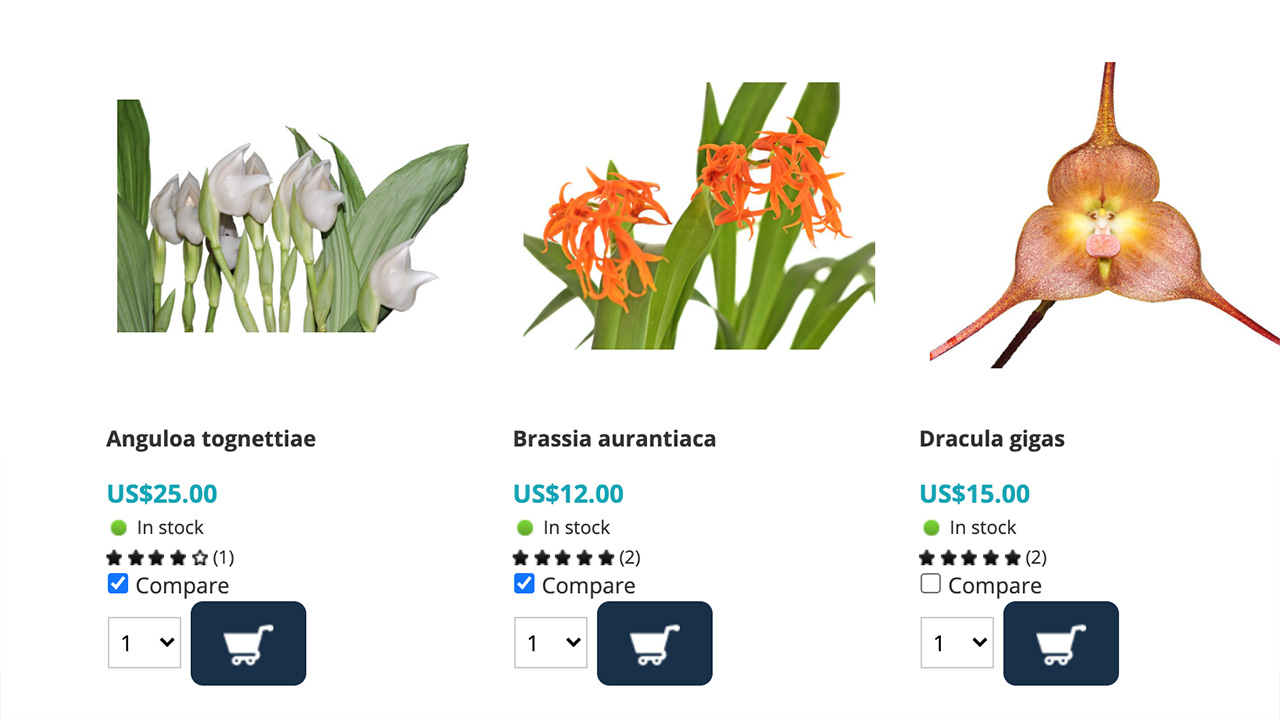
Original Compare Checkboxes
Original Compare Screen
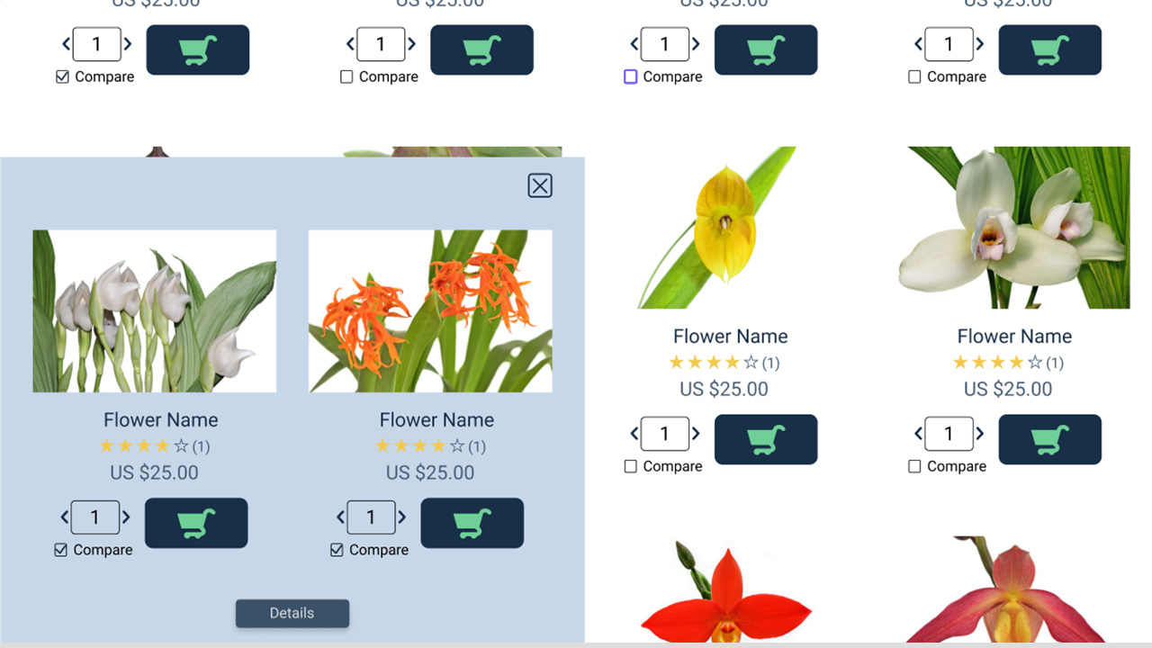
Redesigned Version
Testing:
User testing was conducted to compare the two sites. Several common user tasks were selected and explained to the users. They were timed and their clicks were counted for each task. Once these results were compiled they demonstrated quantitative proof of concept for the proposed changes. The amount of time required to complete the tasks was reduced by an average of 76%. The amount of clicks were reduced by 68%.
Proposed Changes:
Each user was also interviewed after spending some time with each site. This provided qualitative data suggesting several additional changes. These changes included the following:
- Update the cart image with one that has a mesh cart.
- Add the total price of items in the cart overlaid on the cart icon.
- Add the text “in cart” over the cart button on items already in the cart.
- Add the text “out of stock” to the image of flowers that are out of stock.
- Add a filter by plant zone and color feature to the filter.